15.06.2022
WordPress Development
WordPress Website Architecture: What It Is + How to Improve Your Site Structuring
READING TIME: MIN
Table of Content
Here’s a question our WordPress Agency for Development wants to ask you – have you ever found yourself on a website that feels like a confusing maze full of passages, through which you must seek your way?
In reality, most of us have stumbled across such sites, and we believe we can all collectively agree that being lost, confused, and trapped in a blind alley sucks both in the real world and when we’re navigating a website.
If you’re running an online business, the last thing you’ll want is to ruin your brand reputation by offering a poor website experience to your visitors. After all, our WordPress development agency has always said that you should view your website as a business card for your company.
And how do you make that business card (or your site) super appealing to your target audience? By investing in a robust architecture. To keep your visitors’ interest, your site must be structured in an intuitive and easy-to-navigate manner. Otherwise, they’ll bounce in seconds, which can have detrimental effects on your business.
Thankfully, proper website architecture and structuring aren’t rocket science – there are very concrete best practices that, when followed, can guarantee you’ll engage your audience, and your site will rank well on search engines. However, our WordPress Agency for Development has noticed that a lot of people neglect their website architecture, which leads to inevitable complications in the future.
Since we’ve always preached the importance of website architecture and structuring, we’ll use this article to better acquaint you with the concept of it all as well as show you how to build the most solid foundation for your own site. Let’s go!

Website Architecture Explained
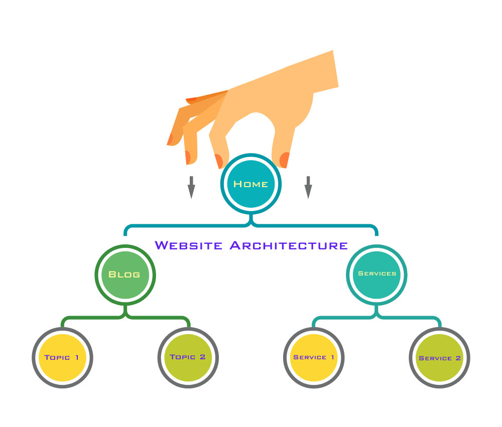
And so, website architecture refers to the hierarchical structure of your website pages. This structure is accomplished through the proper use of internal linking. A website structure’s main goal should be to make it easy for people to access content. Apart from that, the structure of a website is responsible for helping search engine crawlers grasp the interconnections between pages.
Our WordPress development agency couldn’t stress this enough – the structure of your website is crucial to keeping your visitors engaged and increasing conversions. User experience should be at the top of your priority list when crafting your website’s structure.
Remember that having stellar content alone does nothing if users can’t find it. And don’t be fooled – online users will rarely give you a second chance. The moment they feel dissatisfied with the experience you’re providing they won’t hesitate a second and will jump straight to a competitor’s site.
A standard website structure is like a tree chart where the home page acts as the root of everything. Our WordPress Agency for Development advises you to think of all pages that are linked out from the home page as branches. Additionally, each branch has further branches growing from it. All of these branches are then connected to one another.
Website Structuring Matters: Here’s Why
As it was made clear, a good website architecture improves the user experience on your site, which, in turn, can skyrocket your overall business performance. Users may easily discover the information they need when your website is structured in an intuitive manner.
Additionally, an added bonus of solid user experience is the improved search engine rankings you’ll get as a result of it. Our WordPress development agency reminds you that a good user experience means that visitors will spend more time on your website and will likely link to your web pages. This will indicate that your company produces high-quality content.
Here are some bonus arguments that prove just how crucial proper website architecture is for your online business:
- Good website architecture allows search engines to crawl your website more efficiently.
- Good website architecture allows users to go deeper into the site by providing extra pages to explore.
- Good website architecture distributes “page authority” more evenly, ensuring that no page is overlooked.
- Good website architecture enhances thematic authority due to the effective internal linking structure between related or comparable topics.
- Good website architecture improves conversion rate by making it simple to identify products and conversion-oriented content.
As you can see for yourself, our WordPress Agency for Development isn’t joking when we’re saying that website architecture should be your top priority from the early stages of the development process. Get the structuring of your site wrong, and you can say goodbye to having a successful website. It’s really THAT important.
How to Improve Your WordPress Website’s Structuring
Now that you know just what website architecture means and why it is so important, let’s have a look at some recommended practices to keep in mind while building the architecture of your website.
If you’re in a hurry, here’s a summary of our main points (our WordPress development agency will discuss them in further detail below):
- Construct a Simplistic Top-Level Navigation Menu
- Create User-Friendly URLs
- Make Your Top Pages Accessible in 3-4 Clicks
- Use the Pillar-Cluster Internal Linking Model
- Take Advantage of Category Pages
- Create a Sitemap
- Make a Solid Internal Linking Strategy
- Include a Site Search Feature
- Make Use of Breadcrumbs
- Use Canonical Tags
- It’s Ok to Be a Copycat When It Comes to Website Architecture
- Maintain the Consistency of Your Website
1. Construct a Simplistic Top-Level Navigation Menu
Our WordPress Agency for Development believes constructing a simplistic top-level navigation menu is a MUST. We advise you to limit the number of top-level menu items on your site. Also, make sure your menu item’s name corresponds to the content that’s meant to go in it.
Here’s an example: the visitors of your site will expect to be brought to a list of WordPress plugins posts if they click on the “WordPress Plugins” link on your blog’s homepage. You’ll also need to create a simple navigation path back to your blog’s and website’s homepages from this page.
Take a look at the following example from the website of our WordPress development agency:
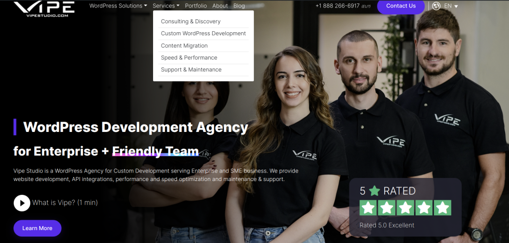
Our top-level navigation menu is quite minimalistic and only features what really matters. We have divided our menu into five simple menu items: WordPress Solutions, Services, Portfolio, About, and Blog. Under the “Services” tab, users can find all the services we provide.
If there’s one thing we want you to remember it is that: whatever you do, just make sure your users aren’t forced to think too hard. A website that is difficult to navigate will most certainly have a high bounce rate. The last thing users want to do is waste their precious time on your website by trying to find what they’re looking for.
Our WordPress Agency for Development reminds you that people will simply leave your site if you make your top-level navigation menu a mess. So, be smart and create a user-friendly web experience.

2. Create User-Friendly URLs
Do you want your website to stay organised? Optimising your URL structure is the way to go. URLs indicate your site’s hierarchy, thus helping humans and search bots see where each page belongs and how they relate to one another.
In this context, our WordPress development agency advises you to keep your URL structure as simple and plain as possible. One great perk of WordPress is that the CMS automatically generates user-friendly URLs based on the titles of your pages (of course, if you don’t like the generated URL, you can always change your permalink structure by going to Setting > Permalinks).
Now, let’s see an example of proper URL structuring. In most cases, it will look like this:
yoursite.com/page-title
You may also construct easily navigable subdirectories:
yoursite.com/topic/subtopic/page-title
Our WordPress Agency for Development can tell you that while subdirectories can be useful for UX, they aren’t essential for representing the architecture of your site. All in all, internal linking is far more important than the structure of your URLs.
Here are some general rules you can follow when creating your URLs:
- Keep your URLs to 130 characters or less.
- Use hyphens to separate words.
- If feasible, avoid using numbers.
- Make your URLs as descriptive as possible.
- Add keywords, but don’t pack them in.
- Make your URLs logical.
- Maintain consistency in category names across URLs and navigation menus.
3. Make Your Top Pages Accessible in 3-4 Clicks
Our WordPress development agency reminds you that visitors should be able to get from your homepage to the most essential pages on your site in only a few clicks, regardless of how many pages your site has.
You must not only provide intriguing content to keep users on your site, but you must also make it simple for visitors to navigate between key pages. In this context, the three-click rule is a popular guideline.
It is highly advisable to make your content accessible from the home page and/or the sitemap page in a maximum of four clicks. This rule should be applied to practically any site with fewer than 10,000 pages.
Our WordPress Agency for Development recommends this approach as it results in a flat site structure rather than a deep site structure for your website. Never heard of flat vs. deep site structure? Here’s the difference:
- If your site has a flat structure, users may access any page on your site with just a few clicks.
- A deep site structure implies that certain pages may require five or more clicks to reach.
You should know that both users and SEO can benefit greatly from a flat site structure. To achieve such a structure for your own site, you’ll need to implement some great internal linking techniques.
This means that link authority flows from pages with a lot of backlinks (such as your homepage) to ones with fewer backlinks (like your product pages). Our WordPress development agency recommends the flat site structure because it ensures that search bots can navigate your site swiftly and effectively, indexing all of your pages.
To benefit from a flat site structure, you’ll need top-level navigation. We recommend you use dropdown menus to include each of your site’s primary categories as well as sub-category pages.
However, you shouldn’t go too far and make every single page accessible from your homepage. A totally flat architecture implies a complete absence of hierarchy, an excessive number of links on your site, and a poor user experience. So, don’t take the three-click rule too literally.

4. Use the Pillar-Cluster Internal Linking Model
Our WordPress Agency for Development can also bring your attention to the pillar-cluster internal linking model (also known as topic clusters, topic silos or a hub and spoke strategy). In this model, you have a parent page (the pillar) that links out to child pages (the cluster). The child pages then link to one another, thus forming a cluster.
By following this model, your internal linking structure will be more clear while also directing users to additional relevant content on your site. Remember that users should quickly comprehend which piece of content an internal link will send them to and why that content is linked from the page they’re presently on.
If you want to go even farther, our WordPress development agency recommends you combine the topic cluster model with content silos. Using a ladder effect, content silos provide even more hierarchical clarity. The idea is that the main pillar page is at the top of the ladder, followed by additional pages. As you move down the ladder, the pages become less significant (and typically more specialised).
Visitors who wish to learn more about a specific subject can benefit greatly from topic clusters and content silos. What’s more, they can also help your site’s rankings. When you create topic clusters and fill them with detailed posts, this will give search engines a sense of your authority.
Our WordPress Agency for Development reminds you that because all of these pages are grouped (or clustered) together, Google can easily determine your authority on a topic and rank you correspondingly. This is referred to as “topical relevance”.
Topic clusters might also assist you in ranking for a greater number of keywords. Pillar pages are particularly good for attracting links and covering wide themes in a way that allows them to rank for high-volume keywords.
If you want to create your own topic cluster, our WordPress development agency suggests you follow these simple steps:
- Begin by looking for pages on your site that discuss the same subject.
- Create a pillar page that connects all of the pages and provides a high-level overview of the topic.
- To construct a cluster, add links from your pillar page to each of the more focused pages.
- Lastly, go over each cluster page individually and look for natural ways to connect them to the other cluster pages as well as the pillar page.
5. Take Advantage of Category Pages
Category pages are comparable to pillar pages, but they lack the content depth that makes pillar pages exceptionally effective link targets. Our WordPress Agency for Development can tell you that category pages can usually be found on eCommerce websites and blogs. They generally only have links to products or blog entries.
Category pages can be very beneficial for you in the long term because they help maintain your site’s architecture organised, regardless of how big your website gets in the future. This means you won’t have to worry about how and where new pages will fit into your existing structure. All you have to do is select the most appropriate category, and the rest is taken care of for you.

6. Create a Sitemap
Our WordPress development agency has often put an accent on the importance of sitemaps. We remind you that a sitemap is a list of all the crawlable pages on your website. Because it shows your site structure in a manner that both search engines and people can understand and crawl, it’s an important aspect of your website’s architecture.
You should be concerned with two types of sitemaps – HTML and XML. Here’s the difference between the two:
- HTML sitemaps are intended for humans and search bots alike. They show the structure, topic clusters, and pages of your website. Only the most significant pages should be included in your HTML sitemap.
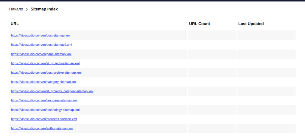
- XML sitemaps are utilised by Google’s crawlers to better comprehend your website’s organisational structure and determine which pages are the most significant. Our WordPress Agency for Development reminds you that although the text-based format of an XML sitemap will be incomprehensible to humans, search algorithms will grasp it properly.
Here’s what the XML sitemap for Vipe Studio’s website looks like:
7. Make a Solid Internal Linking Strategy
Internal linking is a crucial aspect of your WordPress website’s architecture. In a nutshell, this is the process of connecting your website’s pages together. Linking pages together does the following:
- Adds context and relevance to your site.
- Allows visitors and search bots to freely navigate your site.
- Allows link juice to pass between pages.
It’s for this reason that your navigation bar should include links to category pages. Additionally, as our WordPress development agency discussed previously, the parent pages of topic clusters should link to child pages and child pages should link between each other.
You can do more, though. For instance, in the best-case scenario, each page of your website should link to at least a couple of other pages in the copy. If you manage to do that, you’ll achieve a robust internal linking structure.
As you have probably noticed, we have linked to various blog posts throughout this article. This is a great example of internal linking. As a reader, you can now hop to another piece of writing if you want to learn more about a specific topic.
When crafting your own internal linking strategy, our WordPress Agency for Development recommends you pay special attention to the anchor text you employ. Remember that the anchor text informs users and search engines about the subject matter of the destination page. To get the most value out of each internal link, utilise a detailed, keyword-rich anchor text whenever feasible.

8. Include a Site Search Feature
If you want to make your site as user-friendly as possible, you’ll need search functionality. Our WordPress development agency can tell you for a fact that site search is utilised by about one-third of users when it is made available on websites. Additionally, studies show that when visitors use site search, they are 1.8 times more likely to convert.
Adding site search to your website is pretty straightforward. For instance, all major search engines include technology that allows you to integrate a search engine into your website. These site search tools are relatively simple to implement, and they’ll make it much easier for users to navigate your site.

9. Make Use of Breadcrumbs
Hansel and Gretel were definitely right about the invaluable benefits of using breadcrumbs. And did you know that there are breadcrumbs that pertain to your website? Our WordPress Agency for Development is quick to explain.
When it comes to WordPress website development, breadcrumbs are the links at the top of a page that identify the page’s hierarchy within your site.
Put in another way, breadcrumbs are a type of internal linking and a great technique to improve the architecture of your website. They show a user precisely where they are within your site’s structure and make it simple for them to navigate back to a previous page.

10. Use Canonical Tags
Canonical tags play a significant part in advanced on-page SEO. These tags are used when you have many versions of the same page on your website. They basically tell Google and other search engines which of the pages is the most important.
Our WordPress development agency wants you to remember that canonical tags are super important because they limit the likelihood of duplicate content. This means that they prevent search bots from wasting time crawling comparable pages that don’t need to be indexed. As a result, they help improve your site architecture.
If you neglect the usage of canonical tags, your site’s indexed version would be littered with dozens of duplicate pages, perhaps resulting in a duplicate content penalty. You obviously wouldn’t want this to happen.
eCommerce websites can benefit the most from canonical tags since they tend to have duplicate pages due to category filters. Our WordPress Agency for Development reminds you that if you give your visitors the option to search by size, colour, brand, or any other attribute, the same product could be found under many URLs.
So, you should use a canonical tag to specify which page should be ranked. This will ensure that Google won’t index all of these pages and produce a duplicate content issue. Another thing to remember is that canonical tags can be used for both WWW and non-WWW versions of your site (that is if you happen to have the two).
Our WordPress development agency can assure you that it’s relatively simple to add a canonical tag to duplicate pages. Simply add a rel=canonical tag to each duplicate page’s ‘head’ section. This is what it should look like:
<link rel=“canonical” href=“https://vipestudio.com/main-page” />
11. It’s Ok to Be a Copycat When It Comes to Website Architecture
As a business owner, you should know that your customers are accustomed to the website architecture of leading brands within your industry, so it’s totally OK to check the sites of those top players and model your own website’s architecture after theirs.
For instance, if you’re running an eCommerce store, our WordPress Agency for Development recommends you look at how Amazon built their site architecture and try to mimic that on your own website. If you manage to do that, your website will appear more familiar and, as a result, more user-friendly.

12. Maintain the Consistency of Your Website
One of the most important things to have in mind when it comes to website architecture is consistency. It’s absolutely crucial for your navigation format, design principles, and link displays to follow the same pattern.
Our WordPress development agency reminds you that users will stay on your site longer if you maintain these aspects consistent since it will be easier for them to move to different pages and click on links.

Website Architecture Is a Key Aspect of WordPress Development
In conclusion, we can say that the architecture of your website is critical for both user experience and SEO. A robust website structure will encourage your visitors to consume more of your content. As a result, you’ll increase your conversion rate, and you’ll improve your ROI.
As discussed in this article, there are several approaches you can implement to improve the architecture of your website. Remember that there’s always space for improvement when it comes to the proper structuring of your site.
If you’re not sure where to begin, our WordPress Agency for Development suggests you focus your efforts on correctly structuring your URLs and creating topic clusters.
However, the most crucial guideline of all is to keep things simple. The more straightforward your website architecture is, the easier it will be to maintain and tweak it as your business expands.
More on The Topic
- WordPress 7.0: AI Connectors, Real-Time Collaboration, and the Biggest CMS Shift Since Gutenberg
- Balancing Speed and Complexity in WordPress Agency Projects
- WordPress API Integrations: Are They Really Worth It?
- Challenging Conventional Wisdom in WordPress Scalability
- Understanding Client Needs: The Art of WordPress Discovery
Tags: best practicesBreadcrumbscanonical tagsguideinternal linkingnavigationsite searchsitemapURLswebsite architecturewebsite structurewebsite structuringWordPress architectureWordPress structuring
The content of this website is copyrighted and protected by Creative Commons 4.0.


