27.11.2020
WordPress Design
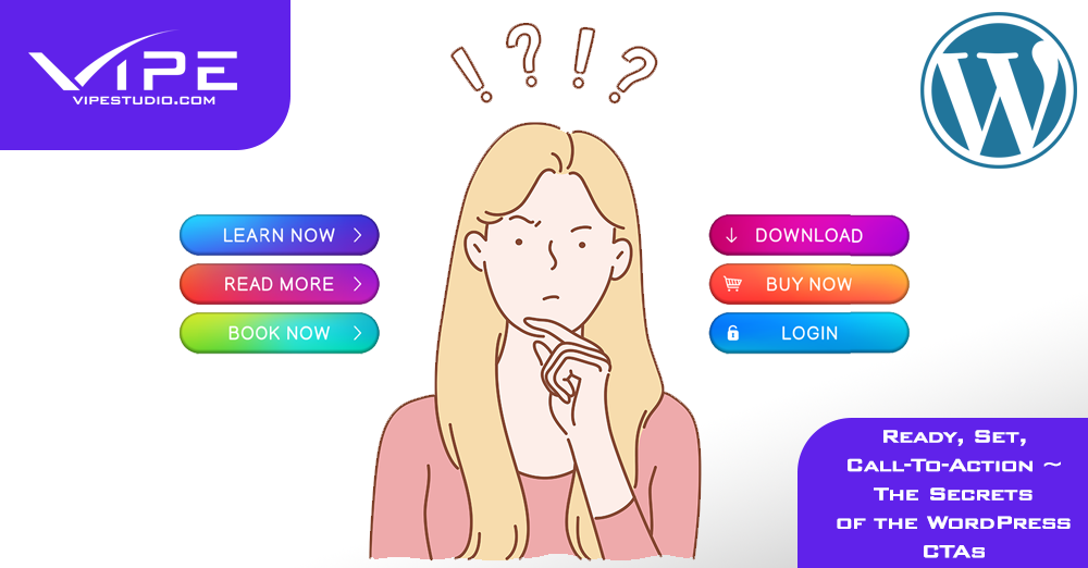
Ready, Set, Call-To-Action ~ The Secrets of the WordPress CTAs
READING TIME: MIN
Table of Content
The call-to-action button (CTA) is the engine that drives the actions of the consumers on the website. It assists in the experience they are going through while checking your site. With it, you can manage the users’ clicks or provoke them to see the thing you have to tell them.
The call-to-action button is a powerful weapon that has to be used carefully and deserves attention from both the consumer and the developer. These days, we all have found something new that concerns us because some call-to-action button told us about it. If we were not drawn by the copy or the design of a CTA on a WordPress website, we would not have that many opportunities to fulfil our requirements on the Internet.
The visualization of CTA buttons wants careful consideration so you can get your consumers motivated to complete an action on your WordPress website the moment they see it. They can be found everywhere around the page, “Click here”, “Add to”, “Download”, “Submit”, etc. but you have to be mindful not to overdo the presence of them, so you do not become annoying. However, you should do your best to stand out from the crowd and not get lost in the monotony that every websites’ CTA offers on the market.
We have prepared some tips and tricks to make the call-to-action buttons on your WordPress website more appealing and engaging. It’s not only what you have to say, it’s the way you say it that stays in the consumers’ mind. Check out what we have for you to make your CTAs work in the best way possible.
Quality over Quantity
Quality always brings better results. If you do something multiple times, but not one of them is correct, all you did is waste your time doing something that does not help you grow. On the other hand, if you have done it once or twice but with great results, you probably chose quite a good way to satisfy your needs. That is the real quality over quantity!
In call-to-action buttons, quality is a must over quantity. Nowadays people are spending most of their free time on the Internet … they have seen a lot of it. They come across CTAs every day, and there is a chance of not noticing them anymore. That’s why you have to surprise them not with the amount of CTAs on your WordPress portal, but with the uniqueness of them. Try your best to make a call-to-action button that grabs the attention and brings to the front reaction from the consumer you want.
The Excitement of The Text
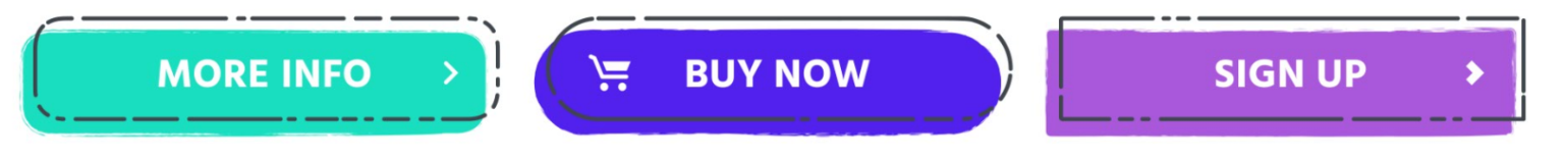
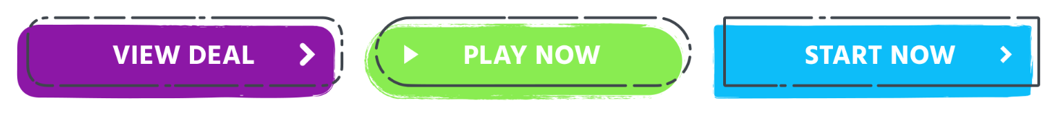
The words have a soul, so why not show it to the world? When deciding how to write your copy for a call-to-action button in WordPress, you should use specific words that affect the user. Avoid mainstream words, such as “Submit” and “Enter” and try to implement the more creative ones, like “Start”, “Stop”, “Build”, “Join”, “Learn”, “Discover”, etc. This will bring life to your text and the readers will pay attention to it.
A tip for your copy of the CTA is to provoke a sense of urgency in the consumers’ minds. That happens with simple words like “Today”, “Only” “Now” that can get visitors excited and inspire them to act. Be direct, be accurate, and play with the words so they can play for you.
“Read More” Button
There are many thoughts and opinions on the “Read More” button and how it affects the consumer. Does it help, or it harms the engagement of your brand, the interface of a WordPress website? The question is not “How to be written?” but “Should it be implemented?”

The “Read More” CTA button operates when you display some content on your WordPress, which is a bit longer and aesthetically unacceptable. At those moments, you write the first sentences or the most valuable part and add a “Read/Learn/See More” CTA. If you have the consumers’ attention, he/she is going to interact with the button and spend more time on your page. That is the option that works best for your WordPress website.
However, it all depends on your audience and how they are going to react to it. The natural meaning of the CTAs is to guide your audiences’ eye to complete an action and make their presence there easier. They are not on your WordPress site to have a hard time or feel stupid, but there is a chance they react to the CTA this way. If your viewers are there to entertain themself, any words like this will let them understand there is work to be done. That has a bad influence on your platform.
Be careful! Do not add some CTA to the WordPress website just because you want to. Everything you do, you should do it for your audience and their contentment and engagement, making your business grow.
Ecommerce Call-To-Action
Do you feel the sound of Mariah Carey whispering that all she wants for Christmas is you in the distance? This sound is coming closer and closer, and before you have realized it, Santa is knocking on your door! That’s right! Christmas is all around the corner and with it comes the big shopping for presents.
These days people do not feel that safe at the shopping center, and a lot of them are turning into online shopping. That is the perfect chance to take advantage of great CTAs, designed for users’ convenience in online shopping.
Except for the “Add to Cart” button, you should also ensure that the payment process is comprehensible for the consumers and not confusing. If they do so, they can easily give up on purchasing from your WordPress website. Provide easy CTAs that will lead the customer to realize purchase.

Tip: Make sure you have come up with different payment methods for your WordPress WooCommerce store like PayPal. Having a PayPal button will increase the chance of ordering from your site just because there are more options, and the user can choose the one that fits best for him/her.
1st Person Speech
Many brands use the second person for their CTAs like “Schedule your consultation”, “Reserve your table”, etc. Yet, this may not be the best strategy for a call-to-action button to fulfill its job. Instead, you can try writing your CTAs from the readers’ perspective and be surprised by the results.
No matter if you suggest the reader to buy a product/service or inform about your business, on your WordPress website, you will want him to feel comfortable and in a safe space to act. Using first-person speech will make him feel like he is in control of the process, and it is all his decision whether to click or not. Just listen to how it sounds: “Subscribe here” versus “Tell me more”. Which one did you like better?
The main job of the CTA is to stand out and first-person speech can be a great way of doing so. The readers are accustomed to reading a second person CTAs and writing yours from their perspective will make you stand out from the crowd. Shake it up a little by writing more “my”s than “your”s.
The Colors
Different colors affect different in consumers’ minds. You should attentively choose the colors of your call-to-actions’ depending on the mood you are trying to arouse with them.
The use of red color for WordPress websites’ CTAs is very frequent. You can easily visualize it in your head because you have seen a lot of it. Red is an attention-grabbing color, and applied this way it screams “Hello, I am here, come and click me”. Red is a very acceptable choice for CTAs because it does not incorporate into the design of many brands, so it naturally stands out and brings attention.

But that does not mean red is the only option you have.
Green or orange is just as good as red, as the results say. Any color can work to your advantage if it differs from the other colors used on your platform. The secret is the contrast. The more contrasting your WordPress CTAs are, the more prominent they will be. You can affect your consumers not only with a value proposition but also with the visual effects.

Make it stands out
When creating a call-to-action button, you should make sure it does not merge with the other text spaces on your page. You have to separate it from your head information, and because of that, attract consumers’ awareness. You can use any engrossing frame in every color to do so. Even just adding a white space that surrounds your CTA will be a way of making it stand out. There are bad examples that place their button where it does not distinguish from the other content on their WordPress. Directing the attention to your CTA is a prominent trick for the eyes of the user to see it and interact with it.
Saucy Shapes
Another trick for the visual perception of the CTA button is its shape. It depends on your audience whether you should use a classic or fresh shape when composing your call-to-action.
For the traditionalists, the shapes that play an efficient role are the rectangle and the square. These shapes are everywhere in our daily life and are also well-known in the digital one. Their straight lines and angles of these two provoke a sense of reliability and security. If you want to look trustworthy and reliable, use one of these shapes for your WordPress call-to-action button.
For the dreamers and free-spirited audience out there, you should use circles, ovals, and ellipses. They look softer and milder than the straight lines of the square and the rectangle and have no beginning nor end. That is the reason they are often associated with magic, mystery, and the universe. If your goal is to look open-minded and compelling, then the rounded shape will help you do so.
There is another option for the CTA shape in a WordPress website, which is said to work best because it mixes both of the previous two. It is the rectangle with rounded corners. This shape draws attention to the content of the button, and the vision concentrates on the text. It does not intimate that you are too strict, neither you are too frivolous. It is an appreciable decision when talking about the perception of the viewer.
Keep it Above the Fold
When discussing your WordPress website development, keeping the dominant information in an easily detectable place, without further scrolling, is a must. Above the fold is the content of the site you see when the page first loads. In other words, it is what the users perceive first on your webpage without scrolling. Make sure your CTA does not get neglected because of its location on the WordPress website. Locating it above the font decreases the chance of passing and not reacting to it.
Natural Hierarchy
On a WordPress website, there are many features, offering different options to the customer. You have different tabs, banners, and every other possibility that the platform allows you to explore. That is why when designing your call-to-action button, you should put it on the top of your priorities. He is one of the main characters of your WordPress website. The other buttons and options should be less attention-grabbing than the CTA. Give it the leading role so it can give you back the desired result. Make it the biggest and the brightest of them all!

Inventing a WordPress CTA button can be useful only when you do it properly. It does not have a right or wrong way, but it has many different paths to take. Whatever you decide you should always bear in mind your target audience and how it reacts to it. Your choices should always be based on their wantings and reactions.
Do not forget that you create it, but they have to interact with it. Observe your consumers and create a call-to-action button that perfectly suits your WordPress website and your business needs.
More on The Topic
- The Human Cost of Poor WordPress Architecture
- WordPress Workflow Design and Productivity
- The Theme Architecture You’ll Regret Ignoring
- From Templates to Total Design Freedom: The Block Editor Revolution
- Enhancing User Interaction on WordPress Sites with Innovative Design
Tags: businessgrowthbusinessstrategyctatips
The content of this website is copyrighted and protected by Creative Commons 4.0.