25.09.2020
WordPress Design
A Good Web Design is not Always the Modern Design ~ a lesson by BoJack Horseman
READING TIME: MIN
Table of Content
Author Intro: When I am working on my WordPress stuff, I often have a background podcast or a tv show. One of my favourites is BoJack Horseman and here is what I’ve learnt from him…
For sure you have played this ‘Associations’ game as a kid, haven’t you? You say a word and then a friend of yours says the first thing that comes on his mind. ‘Horse.’ ‘Knight.’ ‘Sword.’ ‘Shield.’
And then suddenly someone just randomly shouts ‘A frog-shaped extra dark chocolate bar.’ Boom! Game over.
Would you believe if I tell you this is exactly the way a web session in a single website is experienced? The visitor, who is part of the potential target of this web page, opens the website with specific expectations of a horse, knight and a sword and suddenly sees a frog-shaped extra dark chocolate bar.
Plenty of users would still go for the chocolate if it is appetizing, but let’s say it honestly – I am here for the knights, and you have offered me no knights at all!
It is important to know your target and build your website design the way it will be accepted.
Web design trends in 2020
According to one of the most influential websites regarding web design Designmodo and 99design, the trends in 2020 are:
- Dark Mode Design;
- Combining Photography and Graphics;
- 3D On… Anything!;
- Glowing Gradients;
- Streamlined Minimilastic Navigation;
The dark mode comes as a no surprise. More and more users are preferably switching to it, because of a good readable experience.
Not so long ago it was either choosing a graphic or photos. 2020 is all about combining it – aesthetic means a mix between Illustrator and Photoshop.
Three-dimensional imagery is always an instant hit – but trust us, it has to be somehow splashing – you all remember those 3D Spiderman scenes when a web is chasing you.
Flat design is still rocking around, but how a glowing gradient bubble can let you down?
Mega Menu is slowly starting to become old-fashioned. Minimalistic navigation all the way!
Despite all those trends are awesome, we all still wear jeans from 1873, don’t we? The designer best ability is to know when and how to apply the trends!
How important is considering the target when designing a website?
User Intuition only matters if you know what is the expected intuition behaviour of the specific user group.
Recently I have watched an episode of Gordon Ramsey: Uncharted, where the famous chef cooked for the Zulu Chief in South Africa. Despite cooking the meat rare is crucial for Ramsey, he cooked it extremely well-done because of his guest expectations.

The web designers’ true professionalism is revealed when they know exactly how much salt to put on their web design according to the salt preferences of their visitors.
How can a website be killed by a modern re-design?
No needs for big introductions here. Imagine your task is to redesign a 2003 web page for an audience in the age group 50-60, the majority of which are using the website since the 2000s. This example may sound ridiculous, but this is a not so rare task, trust us.
The problem comes when the users are somehow addicted to the classic interface and find scrolling in a hidden minimalistic UI menu unapplicable.
We have seen it – UX/UI means nothing if your 2000-2005 website has a big auditory and needs a redesign. The designer has to match those concerns and find the perfect design for the visitors.
Matching the design with the product as it’s finest: BoJack Horseman
Have you watched the Netflix show of BoJack Horseman? It is about a washed-up Hollywood star of a 90s sitcom used to be a sex symbol anthropomorphic horse, who is currently an alcoholic trying to get his fame back. The show’s season 6 penultimate episode is rated 9.9 on IMDB and was even scored a perfect 10 earlier.
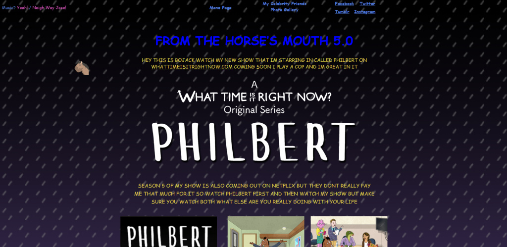
The website of the show is a pure masterpiece! It is super old-fashioned, old-school, old-everything and is true design awesomeness as it is perfectly catching the character spirit. Why? Here is why.
No SSL
![]()
SSL? No Way Jose! This is too modern to even worry about.
Animated mouse
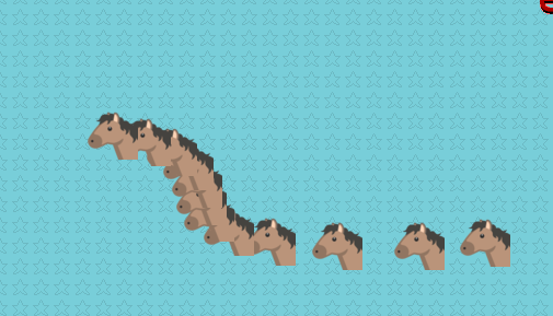
The comparable to nothing feeling of a glitching cursor animation on a rainy 2004 afternoon of visiting websites of your favourite TV shows. The character BoJack used to be a slowly falling star even back then, so the website HAD to be modern for the time.
Related to nothing GIFs
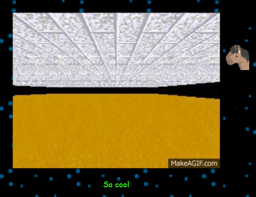
The website creators even titled the non-sense animation ‘So cool’.
HOTMAIL

Hotmail – a blast from the past! Is there anyone who is still using an account there?
Non-working fake web counter
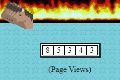
This hit hard! Those counters were massive – they were always fake, the numbers were changing all the time constantly. In a matter of seconds, the count was changing with a hundred positions above. At some point, I was sure those were just GIFs.
Non-working image with genius titles
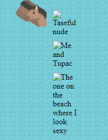
A website from this decade was impossible to exist without a broken image. “The one on the beach where I look sexy” is simply perfect.
BoJackHorseman.com is the best example I can recall for a successful website without following a single trend.
Conclusion
A good professional is always known for understanding the business as a whole. The man behind the desk needs to learn in-depth the good and the bad practices, the modern tendencies and the evergreen cliches.
Vipe Studio ultimate goal is to always apply a solution according to the client desire.
If you find the article interesting, feel free to share, comment and discuss in the form below.
More on The Topic
- The Human Cost of Poor WordPress Architecture
- WordPress Workflow Design and Productivity
- The Theme Architecture You’ll Regret Ignoring
- From Templates to Total Design Freedom: The Block Editor Revolution
- Enhancing User Interaction on WordPress Sites with Innovative Design
Tags: bojackuiuxWeb Designwordpress design
The content of this website is copyrighted and protected by Creative Commons 4.0.


